How to build a break even chart in Excel.
Good afternoon, today we will consider such a fundamental thing as building a break-even chart (finding the break-even point). First, a little theory, so that it is clear what and how we should do:
Break even
in simple terms, this is the volume of production at which total costs equal total revenues and thus there is no profit. This point is needed to understand when profits will start. It also means that the company has passed the payback period. Although, we must immediately make a remark that in real life such a schedule will be difficult to build, because. it includes the assumption that all costs have only two types of behavior: fixed and variable. But more about that at the end.
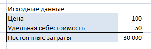
So, to build this graph, we need the following data:
- fixed costs(one digit, does not depend on the volume of production);
- variable costs are directly proportional to the volume of production. The cost of a unit of goods is enough, the variables will be calculated automatically.
- Revenue, but, as in the case of variable costs, the unit price is enough for us.
Price*Volume=Unit Cost*Volume+Fixed Costs
Volume*(Price-Cost)=Fixed Costs
Volume = Fixed Costs / (Price - Cost)
In monetary terms = Price * Fixed costs / (Price - Cost)
So, here is the table that we will work on:
We have to calculate the data for the graph. Volume of production we take arbitrarily, from 100 in increments of 100 pieces.
Revenue And variable costs are calculated as the multiplication of production volume by price and unit cost.
General costs is the sum of fixed and variable costs.
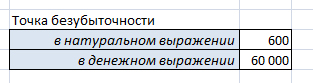
The break-even point is calculated according to the formula that we derived earlier:
Now the data for the chart is ready:
Note that although we only need three curves, I put here the production volume and the break-even curve with one digit. I will need production volume data for axis data X, and the break-even point is needed for clarity.
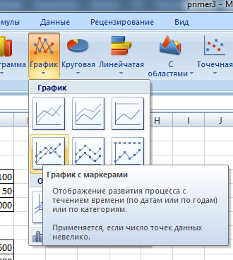
So, we select the data of the four curves (we will need the volume of production later). Then Insert/Charts/Graph/Graph with markers
.
The diagram will appear immediately here, but for better clarity, we will do the following:
- Move it to a separate sheet. Right mouse button on the chart/ Move Chart
/on a separate sheet.
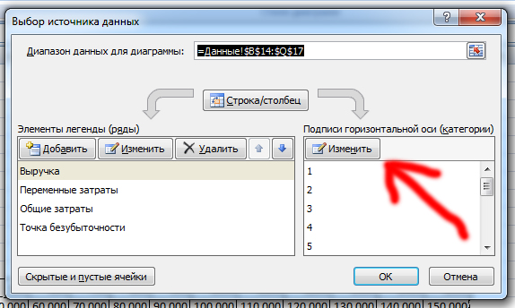
- Change the labels of the X-Axis - Right-click on the diagram /Select Data/Horizontal Axis Labels/Change b and select a row Volume of production(only numbers!)
Highlight the breakeven point with the right button / Data Series Format/Marker Options/Inline
(point and size 10) plus you can change the color: Marker Fill/Solid Fill/Color
(black)
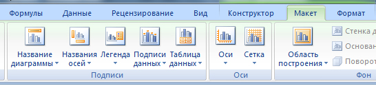
In principle, you can of course play around with the chart parameters, put the chart name, axis name, this can be done through the Layout tab.
So, the main topic has been completed, now I would like to touch on those assumptions, which make it difficult to build this graph in real life:
Assumptions
taken in the process of finding the break-even point and plotting the break-even chart:
- one time period, i.e. fixed costs are given once and do not change, the X scale is not a time axis.
- costs are either directly proportional to the volume of production, or do not depend on it at all. But just passing the ACCA F2 exams, I came across a description of those costs that, although they exist, for some reason were not mentioned at the university: stepped fixed costs (stepped fixed costs) and mixed (semi-variable costs).
- the price does not change, as well as the cost per unit.
- there are no one-time (capital, for example) costs, for example, equipment, buildings, etc. must be purchased at the beginning of production.
- what they produced, they sold.
"The eyes are afraid, but the hands are doing"
 Ready-made business plan with calculations using the example of a web studio
 Registration of an internal memorandum: sample document and drafting rules
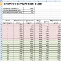 Break even. Formula. Example of model calculation in Excel. Advantages and disadvantages
 Advance report is ... Advance report: sample filling
 How to stitch documents with threads by hand?
 Disciplinary sanction for non-fulfillment of official duties
 Binding your book